Twitter revealed its daily active user count for the first time in February, announcing the site has 126 million daily active users. Although Twitter’s numbers seem pale in comparison to that of Facebook (1.58 billion daily active users as of Q2 2019), Instagram (500 million), and even Snapchat (190 million), this social platform still has a considerable user base. Each social platform has its own intrigue, and Twitter’s appeal lies in the platform’s transient nature.
Users head to Twitter to report on recent news, rant about a recent event, and sometimes even to start a social awareness campaign. Some of these efforts go viral, lasting months and generating real conversations and imposing real changes like the #MeToo movement. Likewise, there are also some efforts that go viral and last about a week or so, like those funny dance videos or witty clapbacks from celebrities to paparazzi (check this out if you want to create a Twitter video strategy). But more often than not, a Tweet’s life cycle lasts for about an hour, at which point engagement usually falls off. With all the buzz that’s generated on Twitter, the team decided it was time for a facelift. The new Twitter layout was made to improve usability and increase engagement by prioritizing more localized and personalized content. Today we’ll discuss the nature of the redesign and answer the pressing question: how will the new Twitter layout affect social media marketing?
Twitter Update July 2019

The reason behind the Twitter update this summer was to give the platform a newer feel it so desperately needed. In recent years, many other social platforms have undergone numerous and large-scale changes to their interface, but this is the first time in a while we’ve seen Twitter drastically change their layout with a completely new redesign. The Twitter team wanted to emphasize a more personalized and localized experience for users with a design that was easier to navigate. When people first heard of the update, many users asked how to get the Twitter redesign, as Twitter only chose a few accounts to test the new layout. These testers then had the option to opt back to the legacy experience, but that option is no longer available after the launch.
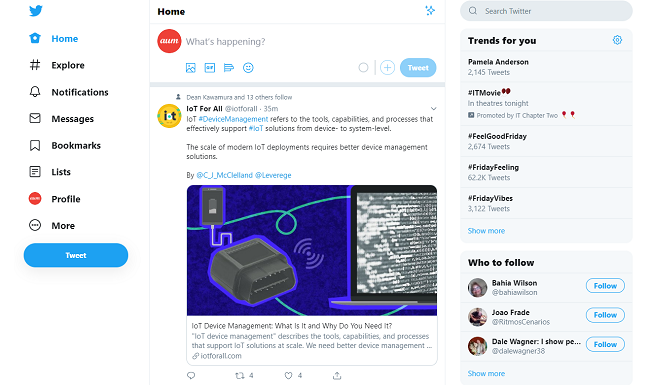
When you see the new layout, you’ll note that the home page has several new changes. For instance, trends and trending hashtags which were previously on the left-hand side of the screen have now been moved to the right, above “Who to Follow.” The Home, Moments, Notifications, and Messages tabs which were previously at the top of the page have also been moved to the left-hand side under the Explore tab, and Moments has further been demoted (because the no one really used this feature) to the “More” dropdown menu. These changes were made to help users explore the site more, with the Explore tab being the first thing on the left-hand side. This tab will show users what’s trending on the site overall versus the right-hand side of the screen, which will offer a more personalized experience tailoring hashtags to what users have previously interacted with and what they will likely be interested in.
After a year of pleading, users can finally enjoy the Bookmarks tab on the left-hand side of the platform. This feature, rolled out a year ago, is a private way users are able to keep tabs on Tweets to #SaveForLater. The compose screen is also a bit different, as the option to insert photos, gifs, or add a polls have been shifted to the bottom-left and, what was once the location feature has been switched to emoji’s. Sharing precise locations on Twitter has also been demoted (because once again, that’s more for Instagram).
New Features & Key Functionality Changes

While the layout has certainly changed, there are also new features and key functionality changes that come with the redesign as well. One of the most important changes that has come about is how messaging is displayed. As described by the Twitter team:
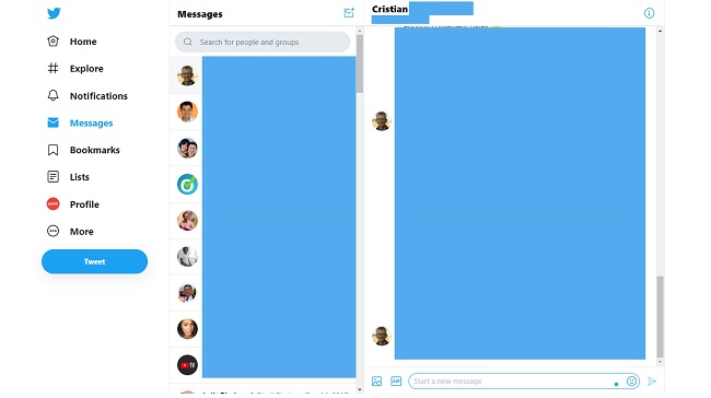
Direct Messages have been expanded so you can see your conversations and send messages all from the same view. Now there’s less hassle switching between screens to send a message.
Long story short, you can now click on “Messages” and all the contacts and accounts who have sent you DMs will appear on a left-side oriented tab, with the conversations on the right. Compared to the previous messaging layout where users had to click messages and navigate in and out of conversations, everything is now more conveniently located on one seamless screen. Twitter has also made it so that users with multiple accounts can more easily navigate between their feeds. This is great news for social media marketing mavens who were tired of maneuvering in and out of different profiles.
For the night owls, the two dark mode themes—Dim and Lights Out—allow for a feed that’s easier on the eyes in the wee hours of the morning. The Twitter team has also recognized the need for further personalization to user profiles, offering users a new range of themes and color options to play around with.
How Can Marketers Leverage Twitter’s Redesign?
Though there are many new changes to the general layout and location of different features available on Twitter, there has been no talk about any changes on how content gets sorted or what is recommended for users. There’s no denying that UI and UX have improved dramatically, but apart from the announcement, the social platform is focusing on more personalized and localized experiences; businesses can assume Twitter will go on as it always has. To best appeal to the new Twitter redesign as a digital marketer, one way you can optimize your content is to cater it to your local community. You can also further personalize content by tagging micro-influencers in your target audience to maximize your Tweets’ reach. Think local and personal if you’re looking for a new way your business can approach the Twitter redesign.
Let’s now move onto the major bomb Twitter dropped in August regarding the Twitter Ads Network. In regards to state-media, Twitter news reported that, “Going forward, we will not accept advertising from state-controlled news media entities. Any affected accounts will be free to continue to use Twitter to engage in public conversation, just not our advertising products. This is a global approach and will be enforced across our entire business.” So while a majority of businesses won’t be affected by the changes, this shift in business practice shows how social platforms are putting users first.
Key Takeaways
Whether it’s to check if there’s a traffic jam down Broadway, or what dance move is the newest craze, Twitter will always be there to let us know. The redesign, which was long overdue, has put users first. Here are the key takeaways you need to remember while enjoying the Twitter redesign:
- The redesign focused on personalization and localization
- There are new changes to the home page layout for better UX
- Direct Messaging has a whole new seamless look
- Users with multiple Twitter accounts can more easily alternate between their profiles
- There are new themes and color options available for users to personalize their profiles, plus two dark mode themes!
- Businesses should focus on catering their content more towards their local audiences
- Twitter is no longer giving state-controlled media and news sites access to Twitter Advertising opportunities
Thanks for tuning in!


Tell us your thoughts in the comments