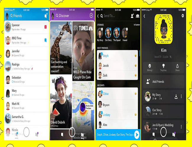
Love it or hate it, Snapchat got a big redesign recently, and people ARE NOT HAPPY. In their official announcement made back in November 2017, they explained that their goal was to separate the social from the media, with Chats and auto-advancing Stories from friends residing on the left side of the app, and Stories from publishers, creators and the community on the right:
Until now, social media has always mixed photos and videos from your friends with content from publishers and creators. While blurring the lines between professional content creators and your friends has been an interesting Internet experiment, it has also produced some strange side-effects (like fake news) and made us feel like we have to perform for our friends rather than just express ourselves.
Snapchat’s Redesign
As part of the app’s redesign, Snapchat created the dynamic Friends page on the left side of the camera — a revamped Friends page that displays your friends based on how you communicate with them. They described it as a sophisticated ‘Best Friends’ algorithm that makes it easier to find the friends you want to talk to, when you want to talk to them.
In other words, instead of scrolling through a list to find the person you want to message, if they’re someone you interact with regularly, they’ll be right there on the top. For example, let’s say you message Jessica more than Claire, who you message less than John. In this scenario, Jessica will be all the way on the top, followed by John, then Claire, and so on.
That’s on the left, and on the right side of the camera is the new Discover page, with Stories from those who aren’t your friends (remember, your friend’s stories are on the Friends page). At the top of the Discover page are your subscriptions, which are then followed by other Stories you might be interested in watching.

A Change in Algorithms
Snapchat pointed out that, because it’s an algorithm change, it might take a while for the app to get you and your preferences right, so give the Friends page some time to realize who your best friends are, and the Discover page to understand the Stories you’ll truly be interested in.
The Love/Hate Relationship
Unfortunately for Snapchat, saying that the redesign was met with mixed reviews is a bit of an understatement. Plain and simple, a lot of people just don’t like change, and while Snapchat claims that the redesign will make the app easier to use, the majority believes otherwise. Instead, they’re saying that it’s made many features more difficult to use.
In fact, a Change.org campaign tited ‘Remove the new Snapchat Update’ is already gaining momentum, with 1,033,826 signatures as of 2:34 PM ET (Thursday, February 15). In this camp is Jessica Liu, a senior analyst at Forrester, who believes that the change will turn off Snapchat’s key user base of teens and young adults:
“Snap’s new product strategy and redesign runs counter to why Snapchat was appealing to its younger demographic in the first place and it could alienate that existing user base because they’re now trying to cater to the masses and Wall Street.” – Jessica Liu
On the other camp is Daniel Ives, chief strategy officer and head of technology research at GBH Insights, who thinks it’s a breath of fresh air:
“This was a much needed redesign for Snap as the complexity and nature of the app was shunning older demographics and a major issue for advertisers, which remain the golden goose for the company.“- Daniel Ives
The Cure
Whatever your stance, it’s clear that Snapchat needs to listen to their users. If you’re one of the few who like the redesign, good! If not, feel free to use this guide to switch Snapchat back to its previous design… temporarily, that is.
Recapping the Redesign
Let’s close with a quick recap. Snapchat’s basic functionality is still there — open the app, take a picture and send, and here’s the breakdown:
- The Stories page is gone: your friends’ Stories are on the new Friends page, and all other Stories from publishers, etc. are on the new Discover page
- They want to draw a distinction between personal and entertainment content
- Auto-advancing Stories for friends are back (to a certain extent): when you watch your friend’s Story, you’re asked if you want to watch the next available Story from another friend (think of Netflix’ autoplay feature)
- They want us to spend more time on the app by watching more back-to-back Stories
- Updated algorithms for more personalization: with time, the algorithms will zero-in on who your best friends are and which content from others you’ll want to see on the Discover page
And that’s Snapchat’s new update. On a final note, not everything is bad. Snapchat’s new text fonts, for example, are well liked ¯_(ツ)_/¯


Tell us your thoughts in the comments