Picture this: it’s a hot summer day and you’re craving something cold. Something cold and sweet, a smoothie perhaps. You close your eyes and feel the coolness of the cup as you imagine taking a deep sip — ahhhhhh, that’s the stuff. Opening your eyes you realize that you can’t help it; you NEED a smoothie. Out comes your phone and you say, “Hey Siri,” (apologies to Android owners) “where’s the nearest smoothie shop?” Etcetera etcetera, Siri tells you of a smoothie place near you. You pull up their website to check out their flavors and one second passes… two seconds pass… three seconds pass… nothing. You are now frustrated because you’re one of the 40% of people who abandon a website that takes longer than three seconds to load.
It’s not the 90s, early 2000s, or even early 2010s. We’re closer to 2020 and we expect pages to load fast, especially on mobile devices where things are on-the-go and speed is a must. It also just so happens to be that one of Google’s ranking factors is page speed, and not only page speed, but mobile page speed.
Therefore, if you want to rank higher on Google searches (and other search engine searches) and lower your bounce-rate, you need to improve your website’s speed. Without further ado, here’s how to do that and by extension, improve your mobile website SEO:
All You Need to Know About Mobile-First Indexing

For the remarkably few who aren’t caught up with the latest and most current trends in SEO, or who don’t know what mobile-first indexing is, here it is: late last year Google announced that because most people search on their site through their mobile devices rather than desktops, their algorithms were going to start targeting mobile versions of websites for ranking purposes. Hence, mobile-first (and here’s a helpful article that will help you adapt to the change).
This means that if you want to be found, you have to prioritize your website’s mobile version. Combining our initial discussion of speed and Google’s mobile-first indexing, we arrive at AMP.
AMP and What They Entail

AMP, short for accelerated mobile pages, are just that; pages that load faster on mobile devices. And by faster I mean FAST, as in really really fast. As in you press on one and before you realize you’re already there.
What makes them so fast, you ask? Three things:
- AMP HTML: HTML extended with custom AMP properties
- AMP JS Library: ensures fast rendering of AMP HTML pages
- Google AMP Cache: can be used to serve cached AMP HTML pages
Combine them and you have the holy grail for mobile speed: AMP (not AMP pages, that’s redundant, like saying PIN number). And if you feel inclined to AMPlify your site (you should), visit this page with tips that’ll help you out. Just keep in mind that AMP are best for sites with static web content such as blogs, news, recipes, videos, etc.
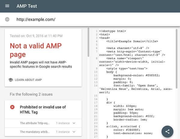
Once you do implement them, use this tool to check them out and test the validity of the AMP markup as well as any structured data on the page:

The Need for Speed
By now you’re probably feeling an itch. An itch that can only be describes as a need for speed, mobile speed. Want to scratch it? Of course you do. Faster websites make Google happy, and when Google’s happy, you’re happy (higher rankings don’t hurt either, nudge nudge wink wink).
And who best to turn to for mobile speed optimization tips than the very people (or bots) you’re trying to appease? Straight from the horse’s mouth, AKA Google, here’s how you can improve your website’s speed:
- Avoid Landing Page Redirects: Redirects trigger an additional HTTP request-response cycle and delay page rendering, hence longer page loading time. An easy fix for this is to get a responsive site, as non-responsive sites load the normal site and then redirect to the mobile version (example.com —> m.example.com/home)
- Enable Compression: Gzip is a method of compressing files for faster network transfers, and enabling it reduces the amount of time to download the resource, reduces data usage for clients, and of course, greatly improves speed.
- Improve Server Response Time: A quick FYI, server response time is the time it takes to load the needed HTML to begin rendering the page. That being said, Google recommends lowering the response time to under 200ms, and suggests the following as possible reasons why your response time is slow: slow application logic, slow database queries, slow routing, frameworks, libraries, etc. Get these checked out and continue measuring your site’s server response time from time to time.
- Leverage Browser Caching: Naturally, it takes time to fetch resources over a network. Therefore, each resource should specify a caching policy that answers whether the resource can be cached and by whom, for how long, and how it can be revalidated when the caching policy expires (Google recommends a minimum cache time of one week and up to one year for static assets that don’t usually change).
- Minify Resources (HTML, CSS, JavaScript): In case you didn’t know, minification is when you remove unnecessary data without affecting how the resource is processed by the browser. Some tools you can make use of are: minify HTML, minify CSS (and here) and minify JavaScript.
- Optimize Images: More often than not, images are the heaviest elements on a page. Optimizing images (reducing the filesize without affecting its quality) reduces the bytes the browser needs to download, and rewards you with faster loading times.
- Optimize CSS Delivery: Before rendering content on a page, browsers must first process a page’s style and layout. As such, the browser blocks any page rendering until all external stylesheets are downloaded and processed. A good fix is to inline small external CSS resources into the HTML document.
- Prioritize (and Reduce the Size of) Visual Content: Above-the-fold content is the portion of a webpage that is visible in a browser window when the page first loads. By prioritizing the main content first (changing the load order so that it loads first), you’re limiting the data and time needed to render the page.
- Remove Render-Blocking JavaScript: Avoid and minimize blocking JavaScript (especially external scripts that have to be fetched before they can be executed), as they have to be executed before the HTML can be parsed.
- Use Asynchronous Scripts: Using asynchronous scripts on your page lets it render much faster because the script is downloaded in the background instead of forcing users to wait beforehand. Good stuff.
- Avoid Plugins: Plugins are mainly used to process special web content such as Flash and Java. Unfortunately, few mobile devices support plugins and trying to load a page with them leads to crashes and stalled pages. More than that, a lot of content that once required a plugin can now be created with native web technologies. The takeaway? Ditch plugins and opt for native web.
Concluding Thoughts
Do one or all of the above tips and you’ll find your website to be much faster. Don’t forget to use PageSpeed Insights, a tool that measures the performance of a page from a mobile and desktop perspective (a score of 85 and above is good), before and after to track progress. And to further improve your mobile site, here’s a post with 5 mobile SEO tips to get you started.


Tell us your thoughts in the comments