Typography is a huge player in design. The same way different colors evoke different emotions, different fonts express different attitudes. Serif fonts are modern, sleek, and clean. Sans-serif fonts are more traditional and formal. Expressing your company through typography, truly, says a lot about your brand. To learn which typeface is better for your business, here are the top 10 typography trends for 2020.
Why Typography is so Important
Typography plays a huge role in branding because the font you select influences how your customers see your brand. Different typefaces actively communicate different messages to your users. Think about how you want customers to view your business and what you want to say through your typographical choices. Big bubble letters have a very different impact compared to tall thin letters. One is seen as fun and playful while the other comes across as more solemn.
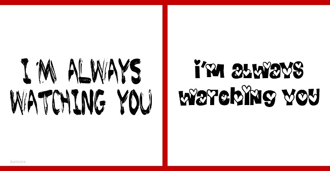
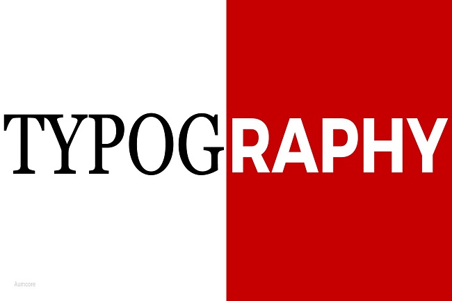
This image is the perfect example of why typography is so important. The same words are showcased on both the left and right sides, but because of the different font types, they communicate a completely different message. Typography clearly includes many different elements but if you’re wondering how do you define typography? It is the technique and design of producing different typefaces.
Top 10 Typography Trends
Last year, some of the biggest trends were hand-drawn fonts, vintage fonts, bold typefaces, and comic sans. Just kidding! Never comic sans. Never. Hand-drawn fonts made a huge wave in 2019. Across social media and especially on YouTube, creatives opted for a more naturally written font display for their thumbnails and videos. Vintage fonts also became a huge hit last year with sans-serif fonts making more appearances across the web. Bold typefaces were popular as well, no doubt because creatives wanted to pack a little extra punch to get their message across. Some of these trends will gain even more traction this year. Below, we’ll go over some of the top typography trends for 2020.
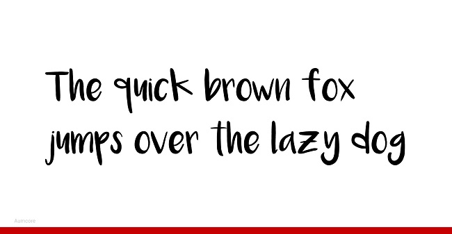
1. Hand-Drawn Typography: These fonts will definitely stick around all 2020 long. Not only do they contrast all the harsh lines of the digital world, they add a personal touch users can appreciate. Hand-drawn typography is great for brands who want to appear more approachable and friendly.
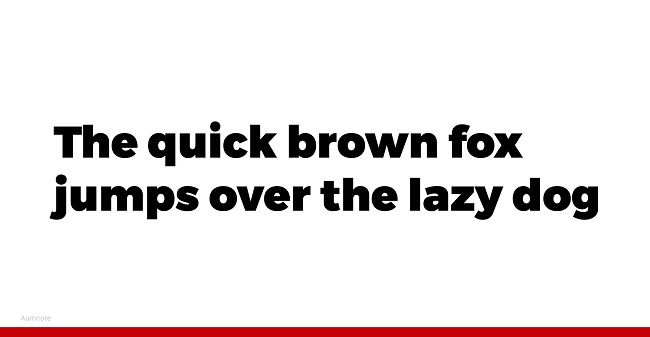
2. Emboldened Fonts: Bold is the new black. The same way black colored clothes immediately make you look chic, bold fonts make your type prominent. Brands and users alike will always have keywords they want to prioritize and bold fonts are exactly how to do that.
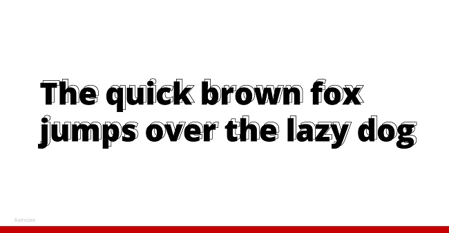
3. Outlined Sans-Serifs: Outlined sans-serifs are another trend that has been picking up. Outlining fonts is a different way to emphasize keywords while adding a stylistic element to the mix. Oftentimes, the outline can be layered with the original text as well for some added flare. This technique is great for brands looking to differentiate titles and keywords from the rest of the copy.
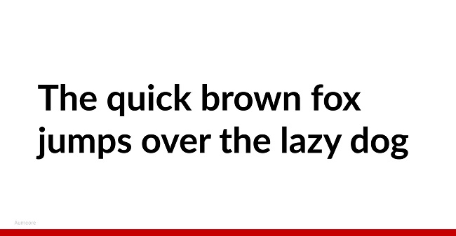
4. Rounded Sans-Serifs: Sans-serif fonts are the fonts of the internet. Rounded sans-serif fonts are especially viewed as modern and minimalistic, which makes them very appealing for digital content. If you’re looking to communicate your brand is new and futuristic, rounded sans-serifs will help you achieve that.
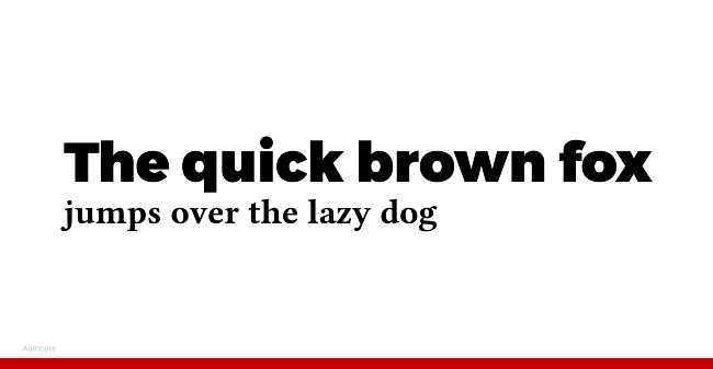
5. Serif and Sans-Serif Combinations: The contrast between these two typefaces will always be welcomed. Balancing a serif title with a sans-serif caption or vice versa, will forever look stylish and elegant. If you’re designing a flyer or email promotion, the combination of serif and sans-serif fonts will help distinguish information hierarchy for your users.
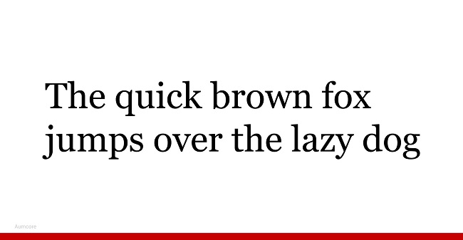
6. Serifs: Serifs are definitely making their way back into mainstream usage. Across the web, serifs are being used to denote a more refined and authoritative messaging. They’re an age old font type but still have applicability even in the digital age.
7. Retro Fonts: As more serif fonts are being introduced back onto the web, there are more retro inspired fonts popping up. Inspired by the older looks of different fonts, these fonts are adjusted slightly to suit the aesthetic of modern day users.
8. Variable Fonts: These fonts are also known as open-type fonts. Originally created by Microsoft and Adobe, they change width and size from the true type to adjust to scale. These fonts are interactive and fun because they’re essentially animated versions of stagnant fonts. They’re great options for brands looking to show off how technologically savvy they are.
9. Continuous Line Art: Line art has also blown up this past year. From imagery to font, line art is the new minimal and modern aesthetic consumers love to see. This font type is great for brands who want to maintain a contemporary and refined look.
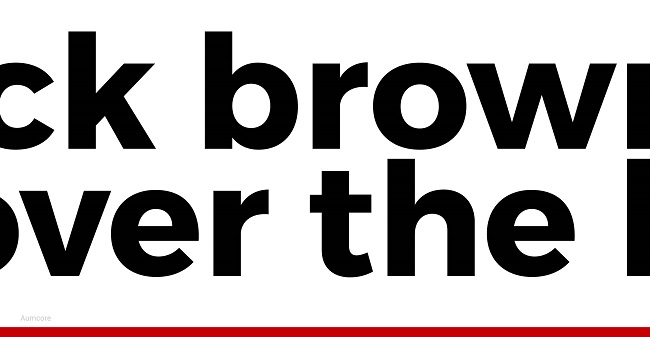
10. Maxi Fonts: You’re probably thinking what is maxi typography? Maxi typography means maximum typography. It means really big type. Brands can use maxi typography in a number of different ways. A popular way designers are using this type is layered with a lower opacity behind other fonts. Use this technique for promotional items and email imagery.
Across the internet, these are the 10 prominent trends being used by designers and creatives alike.
5 Best Fonts for Mobile Web and App Design
The same way images need to be altered for mobile experiences, fonts must also be tailored to smaller screens. User experience and user interface design is all-important in the age where the main objective is to promote interaction and engagement by users. Here are the best fonts to use for mobile web and app design:
- Roboto: This font was actually created specifically for mobile Android usage by Christian Robertson, a Google designer. It was made free for commercial and personal usage in 2012 and is an excellent choice for your mobile content or app design.
- Montserrat: Julieta Ulanovsky is the designer of this font. She was inspired by signage in a historical town of Buenos Aires and also created this font specially for website usage. This sans-serif font is best for those looking for a minimalistic user interface.
- Open Sans: This is another Google commissioned font by Steve Matteson. This sans-serif font is another popular choice for mobile devices. The most notable differences between this font and Roboto is the curvature of the letters is slightly different and the width of the letters is thicker.
- Crimson: This is a retro serif font created by Sebastian Kosch. It was inspired by older fonts like Garamond, Minion, and Baskerville. While it is a serif font which isn’t typically used for digital content, Crimson is a good example of how you can take traditional elements in typefaces and alter them slightly to produce something for the modern eye.
- Playfair Display: Yet another retro serif font which was inspired by Baskerville! This font was created by a Danish designer named Claus Effer Sorensen in 2011. How this font differs from Crimson is the serifs are sharper and the tips of each letter are more rounded. The font overall is also thinner. This font is good for companies who want to communicate a more elegant style through their mobile presence.
These are some of the most used free fonts for digital and web design. The best part is that all these fonts are free for commercial use!
Key Takeaways
Typography trends are always evolving. Just like fashion, some trends come and go with different seasons and others are everlasting. To ensure you’re making the best typography decision for your business, don’t be shy to send out a survey to your consumers if you want to have a data driven approach to web design. Their feedback will show you how users currently perceive your brand and from there, you can alter your typeface as necessary to steer consumers in whatever direction you want! Before you go, here are the key takeaways one more time:
- Typography is important because it’s part of your brand’s messaging
- Different fonts evoke different emotions and have different impacts
- Use hand-drawn typography if you want to appear approachable
- Use bold font typefaces when you’re looking to make a statement
- Outlined sans-serifs are for when you want to emphasize titles and keywords in a more modern fashion
- Rounded sans-serifs have a more elegant feel to them and are great for flyers
- Serif and sans-serif combinations help communication informational hierarchy
- Serifs have a more refined and authoritative messaging
- Retro fonts communicate the seriousness of older serif fonts but in a new and more whimsical way
- Variable fonts are great for showing off your technological savviness
- Continuous line art is for those brands looking to maintain a contemporary and minimalist image
- Maxi fonts are great for email imagery
- Sometimes the best fonts are free and used for mobile design
If you’ve noticed additional 2020 typography trends that weren’t mentioned above, drop a comment and let us know below! Cheers.
Did you like what you saw? If you need our help implementing any of the trends in your next web projects, please see our web design service here.


Tell us your thoughts in the comments