Good user experience (UX) web design is based on how seamlessly a user can navigate throughout a site. Unfortunately, the reality is that designing for a user’s experience within your site is easier said than done. For the average internet surfer, navigating through their favorite site is a breeze; they don’t think twice about its functionality because everything works how it’s “supposed to”. Well, you have your friendly neighborhood UX designer to thank for that.
But what if the UX design fails and the customer has an unpleasant experience? Well, 88% of customers shopping online will not return to a website or online store if they have a horrible shopping experience. The sad reality is that only 55% of businesses test their UX design, and it shows.
With 94 percent of customers making their first impression about a website based on design, it’s so important to get this right. And, if you do, it can be incredibly rewarding. In fact, UX offers a 9900% return on investment, which is massive. This means for every $1 invested, you will get a $100 return!
What Is a Seamless User Experience?
A seamless UX design doesn’t make the user think twice about what they should do next. Instead, it should adapt to users’ needs and behaviors, and feel natural to them.
A positive user experience increases the chance that customers will recommend your product by 16.6%. UX is an art within the bounds of science that creates a business sense and increases the return on investment of organizations. Seamless UX is about providing a meaningful and relevant user experience to increase interaction and retention.
This can be achieved by constantly improving the designs in terms of usability and quality of customers. There are many frameworks and designs that can be used to make your UX Design a success.
What makes a seamless user experience?
A seamless user experience is the quality of any type of cross-channel customer journey. The hand-offs or transactions, from one channel to the next, should involve very little or zero overhead for the user. If you can easily pick up where you left off, the user experience is a seamless one.
For instance, if someone wants to buy an item from your website, they should be able to add it to their basket and checkout with sheer ease. They should not need to think twice about what step to take next. They should be able to complete the task in as few steps as possible.
This is something that you need to apply for each and every part of the user journey, from finding your website to submitting a query.
What is seamless website design?
A seamless website is one where viewers can find the information they need painlessly and quickly. Navigating from one page to the next should be a breeze. They should be able to intuitively use your site.
If you are looking to create a seamless website design, here are some important web design user experience tips:
- Make sure your website is quick to load. It should never take longer than one second for a website to load.
- Make the most of white space, otherwise, your website will look cluttered and overwhelming.
- Navigation needs to be concise and clear.
- Ensure your web pages are consistent, with the same theming and branding.
- All of your pages need to be optimized for use on mobile devices.
- Request minimal information for surveys, sign-ups, or purchases.
- Avoid Page Not Found (404) errors.
Components Of User Experience
Now that you know how to improve user experience on a website, we’re going to delve deeper into the different components of user experience.
As with anything in life, a good old-fashioned recipe for success goes a long way. By knowing what components to consider in your UX design, you can ensure that it forms part of your checklist and delivers a memorable customer journey.
1. Usefulness
Usability is about enabling users to efficiently and effectively achieve their goals while navigating your site, with the least effort possible.
If the design element is not useful to anyone, why would you want to use it? If it has no purpose, it will not be able to compete for attention with a brand full of purpose-built and useful products. It is worth noting that “useful” is in the viewer’s eyes and objects can be considered “useful” if they provide impractical benefits such as pleasure or aesthetic appeal.
2. Desirability
Is your brand desirable, and is the online experience something that many people are seeking? If your website can appeal to your audience and create a sense of community and belonging, you’re on the right track.
3. Accessibility
Is your site easy to access and use? If potential users are unable to access or use your site, then it defeats the whole purpose. So, when developing your website, look into ways of making it user-friendly and easily accessible.
4. Credibility
Find ways of building your brand’s reputation through third-party sources. consider customer reviews, case studies, and other content created by loyal customers to help build a sense of authority on your site.
5. Findability
This ties in with your marketing efforts. If your audience cannot find your site, they cannot use it. The repercussions of this are pretty self-explanatory – no visitors, no sales.
6. Value
Is your site adding value to your customer? You need to determine the purpose of your site and ensure that your design works towards meeting that goal.
UX design principles and best practices
To master UX design, you need to understand the basic principles. We will talk you through them below:
1. Focus on the user – This is the most vital element of UX design. It is not about what you want the user to know or what you think they need to do next. It is about their journey, their feelings, and their experience. Always design with the user 100% in mind.
2. Accessibility – Your website needs to be accessible to everyone. From those with disabilities to mobile phone users, you need to make sure the experience is consistent and enjoyable for everyone, no matter their situation.
3. Hierarchy – People often forget about hierarchy, but it is a critical UX design principle. This means that you map out everything your website is going to contain so that there is a natural structure and everything flows from one element to the next.
4. Consistency – Consistency is key in everything you do. You cannot have one page that has no white space and then another page with heaps of it. You cannot use different fonts on every page of your website. You need to keep everything within the same design palette. Users love consistency!
5. UX testing – You cannot expect to create a striking, effective, engaging, and efficient website if you don’t test it!
10 Ideas for Creating Great User Experiences
If the user has a hard time figuring out what to do, they are most likely going to get frustrated and exit the site. This is especially prevalent among mobile user experience designers who are used to faster loading times. In addition to mobile device optimization, here are ten user experience tips to incorporate into your web design that’ll ensure a seamless website design experience.
1. Keep it Simple
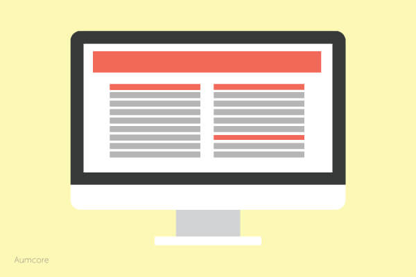
Having a clean, simple layout goes a long way when it comes to UX. Your user has no choice but to interact directly with your content when it’s focused. This allows for easier interactions and causes fewer headaches. Additionally, using a grid system provides a clean presentation, as it will keep your elements and content aligned and displayed neatly.
2. Be Consistent

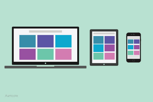
Keep your fonts and buttons the same across your pages for smoother transitions within your site. While changing colors and font sizes may be appropriate to accent different attributes on your site, it’s important for your site to remain consistent throughout to avoid confusion and make navigation a cinch. Speaking of, make sure to keep your designs consistent amongst different devices as well!
3. Shorten the Journey
Make sure your user doesn’t have too many steps from start to finish; too many steps and your user will lose interest. Keep your visitors engaged by keeping forms or surveys short and sweet!
4. Incorporate a Search Feature
Having a lot of content is great, but if your visitors can’t find what they’re looking for, does it even exist? Incorporate filters or sorting options to make your users’ lives much easier and their interactions with your site that much better.
5. Personalize
A site that can adjust and adapt to all users will make them feel like you customized the site just for them. Sites like Pinterest, where you’re immediately presented with pins related to your searches, are already incorporating this feature. Pinterest even goes a step further and recommends pins to be categorized in boards that you already have. Adding this feature allows users to connect and establish stronger ties to your brand.
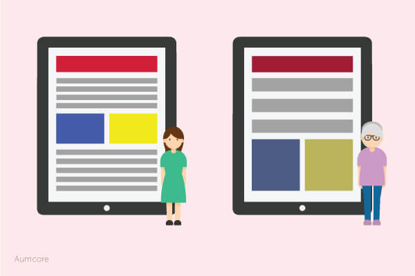
6. Incorporate an Age Responsive Design

This tip takes personalization to the next level. You see, different age groups respond differently to design aesthetics. Whenever a range of age groups utilizes the same service, it’s best to optimize for each so that everyone can comfortably interact with it, increasing your chances for conversions. One way of doing this is to alter certain features such as color saturation and font size. This can really make the difference between good and bad UX.
7. Prioritize the Landing Page
The first screen you see when you visit a new website dictates what your actions will be. A good landing page will intrigue your visitors while a poorly designed one will have them running for the hills.
8. Focus on Color

While color and typography generally contribute more to user interface (UI) than UX, your choice of colors has a big impact on the emotions of your audience. Colors such as red are more noticeable and can be used to flag things as important, whereas shades of blue are used to emit a sense of friendliness and trust.
9. Provide Clear Feedback
It’s essential for your notifications and alerts to be visually distinct so that users are aware of what’s going on. Confirmation messages such as, “Your form has successfully been submitted,” lets them know that they can continue onto the next task. Similarly, keeping consistent style and positioning ensures that your alert notifications are distinguishable each time they appear.
10. Use Simple Animations
Using animations on landing pages or on call-to-actions is a sure way to capture your visitors’ attention. However, make sure these animations are purposeful and unobtrusive. The last thing you want is to annoy your visitors and send them to competitor’s site.
When it comes to UX, usability is very important. However, what is most important is that your site’s functionality should remain undetected, natural, and simple. You want your visitors to feel at home on your site. Good UX equals happy visitors. Happy visitors equals happy you. Don’t you want to be happy?
Contact us and let’s identify all those opportunities for improving the experiences your users have when interacting with your website.


Tell us your thoughts in the comments