Let’s paint a scenario, yes? You have an app and just KNOW that it’s the next big thing…if only people could find it, right? You think to yourself, “what am I doing wrong? The app is there, the people who’ve downloaded it love it, why is it stagnating?” Simple. There are 2,200,000 apps in the Google Play store, 2,000,000 in the Apple app store, 669,000 in the Windows store, 600,000 in the Amazon app store, and you’re there trying to make noise with one single app (or two, or three, but does it really make a difference with these high numbers?).
It may seem like getting your app discovered in this landscape is a modern day Herculean labor for mobile app development, but it really isn’t if you have a good strategy in place. Not to say that it won’t be hard (it most definitely will be), but it’s far from impossible. And to make things easier for you, we’ll cover 10 tips in this post that’ll make your app more discoverable. A quick FYI before we begin, some of these tips build off of one another, so don’t be alarmed if you see some tips in multiple locations. That being said, let’s get your app discovered!
1: Employ App Store Optimization
Starting off this list is app store optimization (ASO), a process akin to search engine optimization that substitutes sites for apps. The goal with ASO is to optimize your mobile app so that it ranks higher in app store searches, resulting in higher discoverability and downloads. Considering that 63% of apps in the Apple app store and 58% in the Google Play store are discovered through app store searches, ASO is especially critical for your app’s success if you’re in the initial branding phase. Included in ASO are a couple of tips we’ll go over in a bit, namely analyzing your competition and optimizing your app’s title and keywords, but we’ll start with a very important tip: understand your target audience. The importance of understanding your target audience cannot be stressed enough because they’re the ones who’ll be downloading your app. How are they searching? Which apps are they downloading? Before you do anything else, you must know your audience.
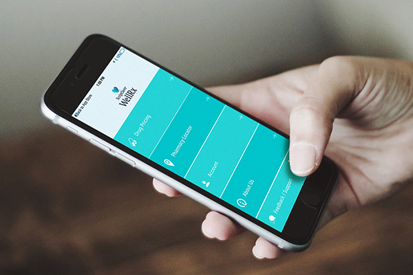
Similarly, it’s important to know what your audience wants. Do they really need yet another messaging app, or would a video sharing one be better? Take ScriptSave WellRx, for instance. They knew that their audience wanted a convenient way of getting discounts when buying prescriptions, so they did just that. The app was even named as one of the top “10 Apps Increasing Healthcare for Low-Income Patients” by Mashable, and has been downloaded well over 400,000 times since.

2: Analyze Your Direct Competition and Other Apps in Top Spots
Part of knowing your audience involves analyzing the apps you’ll be competing with, both directly (similar categories) and indirectly (different categories, but still taking downloads away from you). Let’s start with indirect competition. For these, you want to survey the top apps in a variety of categories and make note of recurring elements. Are they using similar terms or calls to action? How about their pictures, what are they depicting (we’ll go over this in a bit as well)? For your direct competition, you want to search with terms that you foresee your potential downloaders using, and then analyze the apps that come up. These are the apps that are optimized for that particular keyword, so make sure to take it all in and see what they’re doing right.
3: Find Recurring Titles and Descriptions
During the surveying of your competition, you’ll inevitably find titles and descriptions that keep on popping up. Study these and tailor your title and description accordingly. And no, I don’t mean copy and past with you app name instead of theirs. Treat it like a mathematical formula. Why are their first sentences compelling people to click the “more” button? Why are their descriptions getting downloads?
4: Use the Right Keywords
Building off of analyzing your competition to find recurring titles and descriptions are keywords. These are the terms your audience will be searching with, so make sure that you can be found with them as well. A quick aside for mobile app design best practices, don’t use your company or app name as a keyword. They don’t know you, so how can they know to search for you? Save that for when you already have a successful app(s) under your belt. Going back to keywords, make sure that they accurately reflect your app. The last thing that you want is for people to download your app expecting something that’s not there, delete the app, and then leave a scathing review because they felt hoodwinked. To help you out, here are some sites that can help you find the best keywords for your app:
- AppTweak
- App Mind
- Gummicube
- Mobile Action
- SearchMan
5: Choose the Best In-App Screenshots

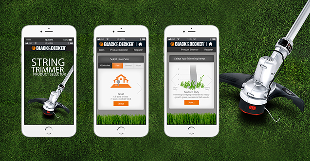
In-app screenshots are the last part of ASO we’ll cover today, and behind keywords, the most important thing you should be focusing on. We have short attention spans. It’s unfortunate, but true. To account for this, and for the fact that many people simply won’t take the time to read your app’s full description, treat your in-app screenshots like your description. The first screenshot is the one that you’re guaranteed will be seen, so make sure it’s the best one. Give people a glimpse of what’s to come and make them wanting more, make sure you’re capturing the most exciting and visually appealing aspects of your app, and most importantly, use high quality screenshots. We’re in 2017, not 2007. There’s no excuse for a blurry or pixelated image. One last note, if your app is available on multiple platforms (Apple, Android, etc.), use platform exclusive shots for each that highlight how its key features look like in each platform.
6: Utilize Gestures
A good mobile app design tool is the utilization of gestures. Making use of gestures other than tap in your user interface (UI) is a sure way of increasing the user experience (UX) of your app. You have tap, double tap, swipe, drag, pinch, scroll, flick, spread, and recently with Apple devices, 3D touch, a feature that senses how deeply you press the display for an enhanced experience. Gestures are also a shortcut of sorts that improve UX by diminishing the importance of buttons, thereby reducing clutter on the app. Just make sure not to overload your users with too many gestures.
7: Make Use of a Minimalist Design
Want to know how to increase user engagement on mobile app usage? Make use of a minimalist design. Not only will it reduce clutter, but it also leave users with no choice but to interact with your content. Using negative space also minimizes distractions and accentuates what’s important. Less clutter = less content to load = faster loading app = higher UX.
8: Pick Your Color Scheme Wisely

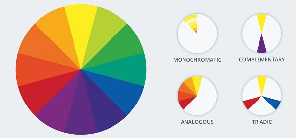
Choosing the right color scheme for your app is extremely important because each color evokes a different emotion. While red heightens awareness, blue calms you down. Yellow makes you happy and purple gives you a sense of luxury. Choose your color scheme according to the emotion you want your audience to feel. You also have a couple of options in terms of color schemes. In a monochromatic scheme, all of the colors come from the same base color; in an analogous scheme, the colors are related to each other and don’t stand out from one another; in a complementary color scheme, colors are opposite and contrast with each other. Take a look at this page for a more in depth discussion of colors and how they can benefit your app’s design.
9: Choose an Appropriate App Icon/Logo
Once you have your color scheme, make sure that your app icon/logo also has the same scheme. Keep it simple, yet impactful. Look at the Facebook ‘f’ or the Twitter bird. They’re simple, yet easily remembered. This is what you want to go for. Keep text to the minimum and context in mind. For instance, GOGI is a nonprofit organization with the mission to advance the growth and advocacy of recreational golf. Keeping within that context, their logo has a playful flag and utilizes two colors. Simple, yet successful.

10: Make Your Splash Screen Count
Last but not least, your splash screen. This is the launching image that appears when you users first open your app. For this, think of what image you want your users to see every time they open the app. Incorporate colors and don’t overdo it. Having too much will only lengthen the start-up time and upset your users. If there is a long load time already, consider including a progress indicator that lets user know how long until the app is ready. As an added bonus you can make it entertaining and increase the likelihood that your users will stick around.
The Wrap-Up
As we covered in the beginning, getting your app discovered is hard. It’s a journey that can take weeks or even months. Don’t be discouraged though, if it seems like too much you can always employ a digital marketing agency that specializes in mobile app development to help you out. If, on the other hand, you’re feeling confident, here’s a wrap-up of what we covered:
- Employ App Store Optimization
- Analyze Your Direct Competition and Other Apps in Top Spots
- Find Recurring Titles and Descriptions
- Use the Right Keywords
- Choose the Best In-App Screenshots
- Utilize Gestures
- Make Use of a Minimalist Design
- Pick Your Color Scheme Wisely
- Choose an Appropriate App Icon/Logo
- Make Your Splash Screen Count


Tell us your thoughts in the comments